The Process of Making the Magazine Advert

1. We began with our selection of main images for both the front of the album cover and magazine advert. We felt it best to use the same image for both to allow for continuity, and we feel this image and the colour tones really embodied the video we were in the process of creating. By focusing on the character who lip-syncs in the video we place heavy emphasis on her significance to the song itself.
2. In terms of the 'Rule of Thirds', the characters central positioning in the frame with the wings on each corner allow for the space to be filled with vibrancy whilst still drawing the focus to the main character in the music video..

3. Our next priority came with the selection of font to be used on both still products. We wanted a casual, fun font that perfectly captured the fun upbeat genre and song that the band had produced. Here is the final product, although we put it in white on he product as it allowed for a better contrast to the background image and reflected the lighter mood:

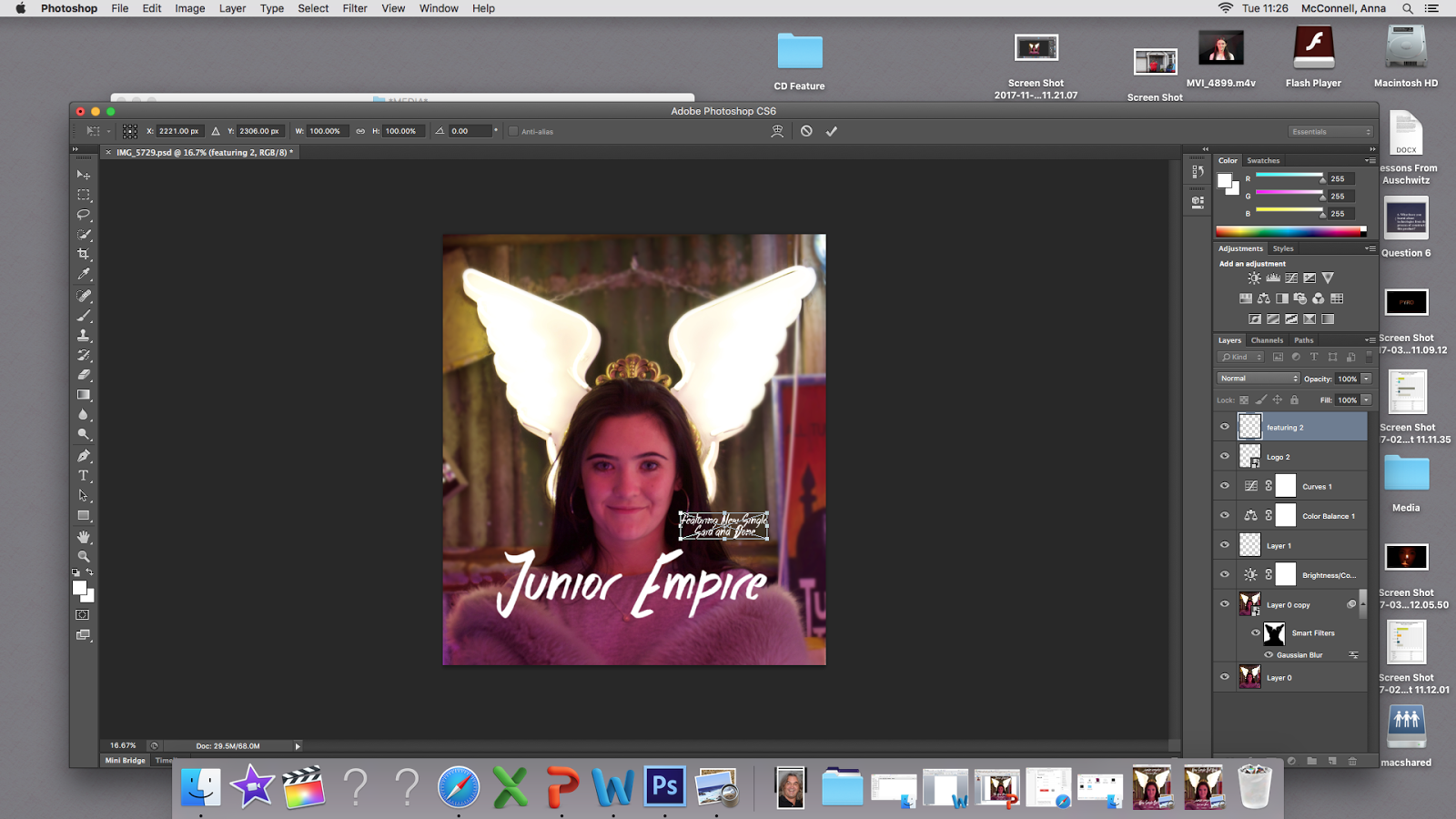
4. Using Photoshop, certain adjustments were made to the photo itself to make the pink tones warmer and blur the background behind the main image of the girl and the wings to further place significance on this character. Furthermore the blurred background softens the vibrancy around the main character.

5. It was at this point we made two different versions of the magazine advert and showed them to our peers to collect audience feedback on which layout they preferred:


Through our feedback we learnt that the majority of people preferred version one as their initial attention was drawn directly to the title of the song and band name, as opposed to the advertising for the single. We had unamomous support for the main image itself as many loved the pink tones and vibrancy of the wings.
6. Furthermore, we utilised Powerpoint as an easier means of adding the clipart stars for the rating at the bottom part of the page. Using the feedback from our audience we went back and made adjustments to the magazine advert to ensure we could make it look as authentic as possible. We later went back and added social media platforms and a release date after feedback that the bottom third looked fairly sparse.


No comments:
Post a Comment
Note: only a member of this blog may post a comment.