Showing posts with label James O'Rourke 6124. Show all posts
Showing posts with label James O'Rourke 6124. Show all posts
Wednesday, 3 January 2018
Tuesday, 2 January 2018
Evaluation Question 3 - James O'Rourke 6124
What have you learned from your audience feedback?


Here our some videos of audience feedback to our magazine advert, our digipak and to the music video:
Audience Feedback on our magazine advert
Audience Feedback on our digipak
Audience Feedback on our digipak
Audience feedback on our digipak design and layout
Audience Feedback of our first rough cut for our music video (1)
Audience Feedback of our rough cut for our music video (2)
Overall, we have found that audience feedback is vital in order to create a successful and genuine media product. That listening to other people's opinions on a certain product can help the creator to design a product that has the interests of the audience at heart, whilst still showing your own creative opinion. The audience feedback we received for our three products allowed us to make more impactful changes to our three products, which allowed us to create products that were genuine and that helped to create a synergistic element to them. (For the audience, memory by association)
Magazine Advert
For our Magazine Advert, we had two different design ideas, which we pitched to some of our audience to ask them which one they preferred. For both of the design ideas we had the same image of the main artist (Megan) positioned in the centre of the frame for the advert, many of the people that viewed both said that it was a good use of the rule of thirds, and that it allows the image to stand out. Also for both of the designs many people liked the fact that we had the use of the warmer colour scheme (the pink, red colours), as they had recognised from our music video which they had watched prior to the viewing of our magazine advert designs, some of the people said that the colour can be linked between the different products (so an idea of synergy between the products) and that it allowed them to remember the products from the colour scheme. However, there were subtle differences between the two designs. One had the band name and the name of the song at the top and 'New Single Out Now' towards the bottom. The second design had it swapped round so the band and song names were at the bottom and the 'New Single Out Now' line at the top. From showing both to our audience the overall feedback was they preferred the first design as they said it highlights the new single and the band name, however, due to the fact that the band 'Junior Empire' is less well known as it being an unsigned band many people got confused with what the band name and the name of the song was. So as a result we decided to change the wording so it emphasised what was the song name, by saying 'featuring new single' followed by the name of the song, and we decided to have the band name in larger font at the top to make it stand out.

This is our final product for our magazine advert
Our discussion about our final product (I'm the student furthest to the right)
Digipak
For our digipak we had different design ideas, so we presented our ideas to our audience to see which one they preferred and which had the most impact. For example we were going to decide about what type and size of font to use for a track list on the back panel and what preferred orientation we should use for the track list. We thought about having the orientation of the text rotated so it was sideways, however many said that it would be less convient for them as they would have preferred to just have the text normally orientated, so they could just pick up the case and look at the track list instead of having to turn the case or their head. Also they liked the synergistic elements that we placed within the digipak, in order to link it to the magazine advert and the music video itself, for instance the image of the main artist (Megan) is used on both the magazine advert and the front of the digipak and the fact the colour scheme is used throughout all three products. In the video above we also talk about our final digipak.
This is our final product for our digipak:

Music Video
For our music video we had multiple stages where we asked feedback from our audience about ideas for our music video. For our initial ideas and brainstorms for our video we presented a group pitch to our class, where we told them about our ideas and they responded with some feedback for us. Some of the feedback was really helpful and useful especially for our filming stages, for example some people said they liked the idea of showing urban youth as they thought that the images we could use of teenagers having fun would work well with the song itself. We also had audience feedback
to our rough cut of our music video, from this someone suggested that we take out a scene from our rough cut that showed someone smoking, they said they didn't understand why this was in the video, so we removed the clip and replaced it with another, this turned out to be better as the images from the clip matched with the pace of the song. Another example of audience feedback we were given was that with our raw footage and our edited cut of the music video, to make sure that we didn't just throw in clips in order to fill a space, it has to mean something and make sense. As a group we found some of the editing process difficult especially when we used most of our raw footage, we also found out that we would spend a while in one section of the music video because some clips made the section look either boring and unprofessional, but in the end we found the correct clips to make our final product. Moreover, when watching our rough cut many people said that some of the clips of raw footage needed to be stabilised especially the clip of the panning shot within the restaurant/bar. However, there were clips we found to look worse when we did fully stabilise them and so we took off the stabilisation in order to make the clip flow and run smoother. In Addition, many people thought that our party scene and the quick cuts that were on the beat of the song were very effective and that it allows the images and the music to sync together. Another person stated that they liked the cut between lip syncing scenes, where the main artist (Megan) looks to the side during a mid-shot and then continues when there is a close-up of half her face, they believed that it was a very good shot, that made it look more professional.
This is our final cut of our music video
Monday, 1 January 2018
Evaluation Question 2 - James O'Rourke 6124
How effective is the combination of your main product and ancillary texts?


Evaluation Question 1 - James O'Rourke 6124
In what ways does your media product use, develop or challenge forms and conventions of real media products?
Created using Visme. Free Online Presentation Software.
Saturday, 16 December 2017

Friday, 15 December 2017
Wednesday, 6 December 2017
23. The Process of Making the Digipak
The Process of Making the Digipak


1. The process began with selecting a template for our digipak, for a selection we found online. Our initial plan was to use one with six faces to work with however after looking through the plethora of stills we had taken, it was difficult to narrow down to just six. By using eight, we were given more available space to incorporate the pans we had taken at God's Own Junkyard.


3. In terms of the first panels you would see when the CD case was first opened we used our best establishing shot of God's Own Junkyard and split it in two to feature as each of the parallel panels. By doing this, the beauty of the image was kept in tact by making the picture huge and vibrant and as a group we felt it best embodied the excitement and vibrancy of the video.


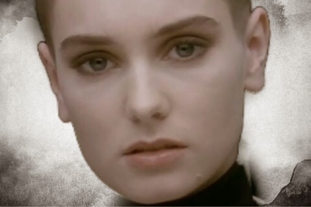
4. The back image on which the track-list would be placed was selected as a close up of the character lip-syncing the song which is a shot featured in the video itself. The monochromatic tones of the shot and the contrast of the pink and black allowed us to place heavy emphasis on the character. Our focus is drawn to the girl's unflinching stare and her beautiful long eyelashes framing the eyes in the left half of the panel which opposes Goodwin's Theory of 'The Gaze' and allows for our character to present a silent yet strong positioning in the video.
Our eyes further gaze upon the out of focus glint on the girl's earring which, using depth of field, bring the focus to that one point of the image.
In terms of intertextual references, the shot references Sinead O'Connor's infamous music video for 'Nothing Compares 2 U'


22. The Process of Making the Magazine Advert
The Process of Making the Magazine Advert
1. We began with our selection of main images for both the front of the album cover and magazine advert. We felt it best to use the same image for both to allow for continuity, and we feel this image and the colour tones really embodied the video we were in the process of creating. By focusing on the character who lip-syncs in the video we place heavy emphasis on her significance to the song itself.
2. In terms of the 'Rule of Thirds', the characters central positioning in the frame with the wings on each corner allow for the space to be filled with vibrancy whilst still drawing the focus to the main character in the music video..

3. Our next priority came with the selection of font to be used on both still products. We wanted a casual, fun font that perfectly captured the fun upbeat genre and song that the band had produced. Here is the final product, although we put it in white on he product as it allowed for a better contrast to the background image and reflected the lighter mood:

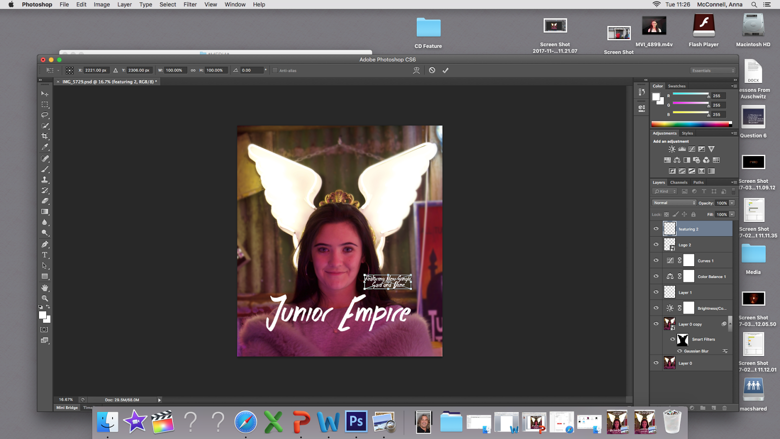
4. Using Photoshop, certain adjustments were made to the photo itself to make the pink tones warmer and blur the background behind the main image of the girl and the wings to further place significance on this character. Furthermore the blurred background softens the vibrancy around the main character.

5. It was at this point we made two different versions of the magazine advert and showed them to our peers to collect audience feedback on which layout they preferred:


Through our feedback we learnt that the majority of people preferred version one as their initial attention was drawn directly to the title of the song and band name, as opposed to the advertising for the single. We had unamomous support for the main image itself as many loved the pink tones and vibrancy of the wings.
6. Furthermore, we utilised Powerpoint as an easier means of adding the clipart stars for the rating at the bottom part of the page. Using the feedback from our audience we went back and made adjustments to the magazine advert to ensure we could make it look as authentic as possible. We later went back and added social media platforms and a release date after feedback that the bottom third looked fairly sparse.


Tuesday, 5 December 2017
21. Construction: Vlogging/Editing/Filming
Vlog from our first filming location!!!!!!!!!!
Video of us editing our music video!!!!!!!!
Video of us creating our magazine advert and editing our music video further!!!!!!!!!
Camera Dolly (Lip Syncing)


Above are some photos of our group filming the scenes for the lip syncing within the music video which is a key convention of many music videos, here we used lighting systems with different coloured filters in order to show the same colour scheme as we used in our other two products and also elsewhere within the music video, especially within the scenes of the group (our members within the location of God's Own Junkyard). We also used the camera dolly within this part but decided that having the camera zoom out using the camera dolly would have been too slow so we used the manual zoom on the camera lens, which turned out to be more effective.
20. Feedback - Magazine Advert and Digipack
Feedback For Magazine Advert and Digipak
We printed out each of the products as examples of what it may look like when finished and presented them to our peers for feedback.
We printed out each of the products as examples of what it may look like when finished and presented them to our peers for feedback.


Feedback For Digipack


Group Conclusion
19. Music Video Rough Cut + Audience Feedback
Rough Cut of our music video!!
Audience Feedback 1
Audience Feedback 2
Audience Feedback 1
Audience Feedback 2
Group Conclusion
Tuesday, 28 November 2017
18. Technical Post: Sound (Use of Microphones)
INSIDE MIC OFF
INSIDE MIC ON
OUTSIDE DEAD-CAT HPF ON
OUTSIDE DEAD-CAT MIC ON
HPF ON
OUTSIDE MIC ON
OUTSIDE MIC OFF
For our music video we tested out using different microphone techniques to see whether this would be beneficial for our project. However, we are not going to use microphones, due to the fact that this is a music video we have decided to have no sound from the raw footage and just have the soundtrack play over the footage.
17. Technical Post: Green Screen
What is it?
Chroma Key Compositing or Chroma Keying, is a visual effects/post-production technique for compositing two images or video streams together based on colour hues.
Why we use it?
We use Chroma Key in order to enhance the experience of a moving/still image, this is also a cheaper alternative than for films to be filmed on location and cuts out any other factors that might hinder the filming process of a film project.

Positives
- Cheap
- Can allow people to theoretically be in any location or environment
- Can save film/TV makers a lot of time
- The shoot wouldn't be delayed by factors such as weather
- The controlled environment provided by a green screen studio ensures that external noise, lighting conditions etc. do not have to be factored into the filming process
Negatives
- A line can be formed around an object while using the Chroma Key.
- That sometimes the image doesn't look real enough to make the location and event believable
- That it can take time and money to train actors and crew on how to use a Chroma Key.
How might we use it?
We would use it in situations where the narrative that we have chosen is in a location that might be fictitious or in a location that would be hard to get to, to film at or that we didn't have the budget or the time to travel to the specific location that we needed to go to.
Our Green Screen Attempt:
Friday, 24 November 2017
16. Technical: Camera Composition/Camera Dolly
Here we have a test for a moving image shot, following one of our classmates, we thought this would be useful for our music video, as we planned to have moving shots within our music video as we were going to follow a group of teenagers on their day out, hanging out with each other.
We thought that we would test using the camera dolly as we thought that we might use it for one of our establishing shots of one of our locations, however in the end we didn't really use it, only for the lip syncing scenes to some degree.
15. Technical: Lighting
Technical - 3 Point Lighting
Here is our compilation of the three different types of lighting used as well as coloured filters in order to create various atmospheres when placed in front of the lighting source.


Tuesday, 21 November 2017

12. Rule of Thirds
Rule of Thirds - Group Work


The Rule of Thirds is a term that is used by film makers and photographers in which an image is located in specific locations within the frame. The first image above shows the guidelines that would be displayed on a camera screen if the setting was chosen to show it and the second image above shows the points where the guidelines cross/intersect. The third image reveals an animal positioned on two of the intersecting points. The Rule of Thirds is used so the camera can be pointed at objects that are positioned on the guidelines.
Pictures using rule of thirds


The Idea
The Rule of Thirds is a term that is used by film makers and photographers in which an image is located in specific locations within the frame. The first image above shows the guidelines that would be displayed on a camera screen if the setting was chosen to show it and the second image above shows the points where the guidelines cross/intersect. The third image reveals an animal positioned on two of the intersecting points. The Rule of Thirds is used so the camera can be pointed at objects that are positioned on the guidelines.
Pictures using rule of thirds

Centre

Left intersection points

Right intersection points

Right third

Left third

Centre third
From these images we can see that the use of the rule of thirds can give us ideal shots for our thriller opening.
Friday, 10 November 2017
Tuesday, 7 November 2017
10. Story Board
11. Summary - Walking into the train station
Shot – medium close up of back of head
Angle – Medium / Level
Movement
- walking in front of camera and towards the station
Composition – left side
Time- 0-6 seconds
22. Summary- train going past
Shot – A mid shot
Angle – Level
Movement - Pan
Composition – Centre
Time – 7-10 seconds
3.
Summary; Lip sink, standing in station
Shot – group shot
Angle – level
Movement
- Still
Composition – centre
4. Summary;
Lip Sink, zoom out
Shot – close up
Angle – level
Movement – zooming out
Composition – centre
5. Summary; walking to cafe
Shot – Pan
Angle – Level
Movement - Tracking
Composition – Centre
6. Summary;
shot of feet walking into cafe
Shot -point
of view, hand held
Angle –
high angle, tilt
Movement –
Tilt
Composition
- Point of view
7. Summary;
Walking in sitting down at table, friends smiling
Shot – Point
of view
Angle – Hand
held
Movement – Go
Pro filming
Composition-
point of view
8. Summary;
composition of shots, laughing, holding hands, pouring coffee
Shot- close up,
hand held camera
Angle - level
Movement – tracking
shot, zoom
Composition –
Left side
9. Summary; skate park
Shot- go pros,
hand held
Angle- high angle
Movement – panning
Composition –
centre
10. Summary;
chilling in London EG; bikes, walking, eating
Shot – close
up, Go Pros, tilt
Angle – Tilt,
Centre
Movement –
Panning
Composition -
11. Summaries; Journey to Gods Own Junk Yard, Opening door
Shot – Close
up
Angle – Tilt,
Centre
Movement –
Zoom
Composition –
Panning
12. Summaries; Gods Own Junk Yard- looking around people in
shop
Shot – Close
up, Group
Angle – Tilt,
Centre
Movement –
Zoom
Composition –
Panning
13. Summaries; Gods Own Junk Yard – signs, laser beams
Shot – Close
up
Angle – Tilt,
Centre
Movement –
Zoom
Composition –
Panning
14. Summaries; drinking – buying alcohol, walking to party
Shot –
Shot
Angle – Tilt,
Centre
Movement –
Zoom
Composition –
Panning
15. Summaries; walking in to party, people dancing
Shot – hand
held
Angle –Centre
Movement – walking
Composition –
Panning
16. Summaries; montage of shots from different locations
such as junk yard, bus, train, running, laughing and leaving party, night sky
Shot – tracking
Angle –Centre
Movement –
walking
Composition – zooming
Subscribe to:
Posts (Atom)