Sunday, 24 December 2017
Evaluation Question 3 - Harsh Makwana 7101
What have you learned from your audience feedback?
Here are some examples of our audience feedback of our magazine advert, CD cover and the music video itself:
Evaluation Question 2 - Harsh Makwana 7101
How effective is the combination of your main product and ancillary texts?
Evaluation Question 1 - Harsh Makwana 7101
In what ways does your media product use, develop or challenge forms and conventions of real media products?
Conventions of an Indie/Pop music video:
- Live performance from the artist
- Main settings are in studios, cities, parks, streets
- Narrative is shown through the visuals
- Dialogue is often used to either begin the narrative or conclude the story
- Extreme close-ups are common as it introduces the artist or the antagonist to the audience
- Tilt shots and pan shots are commonly used
- Handheld shots are also used, often to show a memory
- Filters are often used to give the audience a certain idea - eg. black and white filter is often used to show a memory or to represent the past
- Fast and slow cuts between shots are used, often to reflect the pace of the music, creating an atmosphere for the music video
Goodwin's theory states there are 5 key aspects to a music video:
- Relationship between the song and visuals
- Narrative and performance of the song
- Thought-through beat
- Technical aspect of a music video
- Star image being made the centre of attention
There is a relationship between our visuals and the lyrics of the song to some extent. There are lyrics linking to independence, freedom and travelling, and we have incorporated that into our visuals, with shots of trains and a lot of walking shots. There is no fixed narrative; we deceived upon this as it would give us freedom and allow our creativity to take over, illustrating the theme of freedom and independence. In terms of a thought-through beat, we had every clip in our music video cut to the beat, with that changing to every half-beat during the second half of the chorus. We did this as there was a guitar added to the track at that point, making the tempo sound faster, so we decided to reflect and enhance that change of tempo through the visuals. We also decided to increase the speed of these clips to again amplify the change of tempo.
Prior to filming our music video, we as a group had to decide what conventions we planned to adhere to, and what conventions to challenge. Taking inspiration from many different Indie/Pop music videos, here is how our media product uses, develops or challenges forms and conventions of real media products:
Gender Neutralisation and The Fourth Wall
Initially, we intended to use a male actor to lip-sync the male vocals however as a group, we decided it would be interesting to go against the stereotypical music video and have a female lip-sync a male's voice. It has been done previously, most notably in The Hunna - Never Enough music video, where they too have a female lip-syncing a male, however it is not conventional. During our lip-syncing scenes, similar to that of The Hunna - Never Enough music video, the female actress is positioned centrally, linking to one of Goodwin's features of the star image being made the centre of attention. Our actress is against a black background and is seen wearing a fur coat, with her collar bones on show. Although many music videos do feature sexualisation of the female body, most notably the works of Robin Thicke and Miley Cyrus, it is not necessarily a convention of the Indie/Pop genre and so we decided to stay away from that, with our actress' collar bones only being made apparent to highlight natural beauty as opposed to sexualising her.
Something that we explored and that comes under one of Goodwin's features is the fourth wall and the breaking of it. Regardless of the genre, the fourth wall is almost always broken in music videos, with the actors or artists looking directly into the camera. We decided to adhere to this convention as it would be easier to film and make the acting more authentic. We also decided to break the fourth wall to build up rapport with the audience. As mentioned in the costume section of this blog post, all the actors are of a similar age as the target audience, and so we made the decision to further this empathy between the audience and the video by having the lip-syncing done directly into the camera and by also having the actors looks into the camera at various points in the video. As seen below, no matter what genre the music is, the breaking of the fourth wall is a reoccurring theme.
 |
| Our breaking of the fourth wall |
 |
| The Hunna - Never Enough |
 |
| Pop/Rap Song |
 |
| Rap Song |
 |
| Indie/Pop |
Mise-en-Scene
Costume
As we, the members of the group, were the actors in the music video, and we are all of a similar age to our target audience, we decided to wear our own clothes in order to enhance the relationship between our video and our audience. Our costume also reflecting the theme of that sort of 'urban youth' lifestyle. Our costume is also similar to other Indie/Pop songs, for example The Wombats - Give Me A Try, adhering to a convention of the Indie/Pop genre:
 |
| Our Media Product |
 |
| The Wombats - Give Me A Try |
Setting
As mentioned before, our music video aims to highlight freedom and independence, reflecting the fast paced lives that teenagers live. One way that we encoded this into our video is thought the use of many different settings. One setting in particular that takes up the majority of our music video is God's Own Junkyard, a neon light shop. We used this as a setting as the venue itself is bright and vibrant, which was what we initially set out to achieve. Another one of our settings was at a party. As seen below, the party was a neon party, which fit the theme of our music video perfectly. This is something many music videos have explored, espeicially when focusing on the youth and young adults as it is an aspect of youth life, especially in Indie/Pop songs, such as The Wombats - 1996.
 |
| Our party scene |
 |
| The Wombats - 1996 |
Editing
As mentioned previously, lip-syncing directly into the camera is a convention of all music videos, not only the Indie/Pop genre. The editing of the lip-syncing shots against the audio line was difficult to perfect due to the timing. We as a group wanted to perfect this piece of editing as it was vital in establishing rapport with the audience. We used stabilisation in may of the party shots again to enhance the rapport with the audience; party scenes are very common in music videos and because our target audience are of a similar age to us, parties are very much a part of the youth's lives and in stabilising these clips, we made the content of the video more immersive. We also edited our footage to have many quick cuts and jump cuts. We included these clips to accentuate how quickly life goes by, and how in particular the teenage years fly by. This is a technique also used by other music videos, such as The Wombats - Give Me A Try:
 |
| Quick cuts in our music video |
 |
| Quick cuts in The Wombats' music video |
Conventions of a Digipak
Front Cover

- Eye-catching
- Album cover art
- Usually has the same artwork as the CD
Internal Panels
- Booklet
- Name of band/artist
- List of songs on album
- Song lyrics
- Personal Messages
- Artist information
Our Digipak
Overall, our digipak conforms to the conventions of real media texts. We took inspiration from Michael Jackson's 'This Is It' as well as many other digipaks with the track list on the back panel. We also took inspiration from many other digipaks with the featuring of a lyrics sheet on one of the inside panels. We also took inspiration from the digipak below in that the protagonist of the music video is at the forefront of the digipak cover.

Magazine Advert
Real media texts are very similar in that they do tend to feature the artist on the front cover. In a similar way, the magazine advert for 'Said and Done' also features the protagonist in the forefront. We took inspiration from the way they used the rule of thirds and in response, positioned our protagonist centrally to create an rapport with the audience as seen below:


Friday, 22 December 2017
Evaluation Question 4 - Anna McConnell 7104
4. How did you use new media technologies in the construction and research, planning and evaluation stages?

An example of manual focus and experimenting with depth of field from our music video


Here are examples of our group using the DSLR camera in action to film the shots of Megan that would ultimately used for lip-syncing. In addition to this, here is a video providing a behind the scenes insight into the process of choosing the typography and making adjustments to it in Photoshop.
Construction problems and how we overcame these issues


Electronic noise over our shots
Initially, when planning our music video, we assumed that the shots we would film in the glow in the dark party scene would be vibrant and clear, even though it was filmed in almost complete dark. However, when looking back at the footage, we recognized that the majority of the shots featured a significant amount of noise across the screen, causing the shots to look blurry and unprofessional. Despite this, we recognized that by speeding up the footage, the noise was hardly distinguishable whilst allowing the shots to still remain vibrant and dynamic.
Focusing the DSLR Camera
The focus function on our particular DSLR was significantly temperamental. Many of the pans and depth of field shots in the streets of central London we aimed to feature in our video had to be re-evaluated as, when attempting to focus in on a particular sign, the shot was intermittently blurry due to the autofocus turning off midway through filming. Due to time restraints, we could not spend an extensive period of time re-filming the same shot, consequently forcing us to keep moving location until we found the outdoor ping-pong table, which was ultimately a success to film.
Final Thoughts:
With more experience of the software and a longer time to work, we were able to take more creative risks with our editing; experimenting with different transitions and filters. We enhanced the vibrancy of the scenes at the neon party and God's Own Junkyard in order to make the scenes look visually enticing and make the colours more spectacular to watch. In order to keep the audience engaged and maintaining a sense of verisimilitude, we spent the majority of our time editing the lip-syncing, frame by frame, in order to sync the audio and visual lines seamlessly. This was perhaps the most vital part of the construction process of the music video as it played a huge role in determining how realistic and effective the end result of our music video was.
Evaluation Question 3 - Anna McConnell 7104
What have you learnt from Audience Feedback?

Here we show numerous variations of audience feedback we took over the course of the process:
In this first video, we pitch our idea to teachers in our school in order to see if they initially understand the ideas we are putting forward and if they have any concerns about any aspects.
The importance of Audience Feedback
Audience is a very important concept throughout media studies, particularly in the music industry. All media texts are made with a particular audience in mind eg. a group of people who will receive and make some sort of sense out of what they are seeing. Generally, the producers of the music videos will make a profit from the views made on the video hence why it is so critical to appeal to an audience and use audience feedback to stay in tune with exactly what the target audience would want to see most. Therefore, we were meticulous in the feedback section of our planning and throughout the construction to ensure that we stayed true to exactly what our audience wanted; keeping them in mind at all times.
We used face to face interaction with our audience which was recorded as well as online platforms such as Survey Monkey, both of which were easily accessible for us to constantly refer back to.
Initial Audience Feedback
Here we show numerous variations of audience feedback we took over the course of the process:
In this first video, we pitch our idea to teachers in our school in order to see if they initially understand the ideas we are putting forward and if they have any concerns about any aspects.
We then visited our school library to get feedback from students who did not necessarily study Media in order to get their feedback on our ancillary texts. We made two versions of the potential magazine advert and showed our audience, asking which one stood out to them most.
As we had not told them who our artist was and what the name of the single was, we were enabled to understand where their eyes were first drawn to anyhow they interpreted the text. The unanimous decision was that the title should be on the bottom half next to the the other pieces of institutional information.
Class Feedback of our Final Product
Our work was presented to our class peers who have been involved in the evolution of our coursework through their continuous audience feedback.
They gave us numerous points of constructive criticism including the removal of a moment that we faded to black. To us initially the black screen created a break between the fast paced action and emphasised the drop of the beat however to our audience this seemed like an error during the editing process.
The audience enjoyed our use of vibrant lighting and quick successions of cuts as they felt it perfectly encapsulated the indie-pop genre.
Our Response to Audience Feedback
Group Response
Final Thoughts:
After reviewing our initial audience feedback in the form of our Survey Monkey, we compared the elements that kept true to the audience's preferences and how we adapted our concept to be more practical when it came down to filming the video itself.
These are my final thoughts..
(I am the student on the left)
Evaluation Question 2 - Anna McConnell 7104
2. How effective is the combination of your main product and ancillary texts?
Synergistic Elements between the Main Product and Ancillary Texts
Here are a series of Gifs of our music video from which we can see props used for the stills in our digipak and magazine advert.
We recognized the importance of having continuity between all of the products we made as it allowed for a brand to be created; thus there are many elements that feature throughout the range of products we made.


It would be difficult to ignore Megan's unfaltering gaze and the highly contrasting colours which make it effective as a marketing product as it would draw in a greater audience. Here is also an example of the layout of a magazine advert.


Final Thoughts:
The combination of our main product and ancillary text was largely successful in terms of the idea that there was a great deal of continuity and intergration between the products, mirroring the use of synergy in authentic pieces. I feel that we efficiently created a brand from both of our products, particualry through the use of the bold white typography which, although simplisitic, is easily legible and distinguishable regardless of what product is it included on.
Evaluation Question 1 - Anna McConnell 7104
1. In what ways does media product use, develop or challenge forms and conventions of real media products?

Final Thoughts


Examples of Existing Print Products


Saturday, 16 December 2017


Friday, 15 December 2017
Wednesday, 6 December 2017
23. The Process of Making the Digipak
The Process of Making the Digipak


1. The process began with selecting a template for our digipak, for a selection we found online. Our initial plan was to use one with six faces to work with however after looking through the plethora of stills we had taken, it was difficult to narrow down to just six. By using eight, we were given more available space to incorporate the pans we had taken at God's Own Junkyard.


3. In terms of the first panels you would see when the CD case was first opened we used our best establishing shot of God's Own Junkyard and split it in two to feature as each of the parallel panels. By doing this, the beauty of the image was kept in tact by making the picture huge and vibrant and as a group we felt it best embodied the excitement and vibrancy of the video.


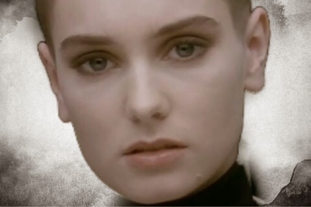
4. The back image on which the track-list would be placed was selected as a close up of the character lip-syncing the song which is a shot featured in the video itself. The monochromatic tones of the shot and the contrast of the pink and black allowed us to place heavy emphasis on the character. Our focus is drawn to the girl's unflinching stare and her beautiful long eyelashes framing the eyes in the left half of the panel which opposes Goodwin's Theory of 'The Gaze' and allows for our character to present a silent yet strong positioning in the video.
Our eyes further gaze upon the out of focus glint on the girl's earring which, using depth of field, bring the focus to that one point of the image.
In terms of intertextual references, the shot references Sinead O'Connor's infamous music video for 'Nothing Compares 2 U'


Subscribe to:
Posts (Atom)